How I Stage and Edit my Photos for Instagram and Etsy
When I first started on Etsy I knew I needed to 'stage' my
photos. The more professional they looked, the better. I already loved to take
photos, so I assumed this would be a walk in the park for me. I also assumed it
would be a lot of fun. I texted my dad right away "Can I borrow your nice
camera?!" and drove 30 minutes to pick it up. I had 12 pieces of artwork
all ready to photograph. I was buzzing with excitement the whole way home.
Etsy, here I come!
Unfortunately this story doesn't have a happy ending. The photos
turned out horribly. I wrapped up that first photography session feeling a lot
more disappointment than pride. But I didn't make 12 pieces of artwork for
nothing, so I kept on trying.
6 months later, here you have it: What I've learned about
staging photos.

Disclaimer: I know most people these days are proficient at
staging and editing since Instagram is so popular now. This is just a short
guide for anyone who, like me when I started, could use a few tips to improve
:)
And when I say bright, I mean the brightest space you can
possibly find. The brighter the better!!! And I'm not just talking about
sunlight (although sunlight will 100% give you better photos than artificial
light, unless you have some kind of fancy photography lamp); the colour of the
room or background is also important. You really can't go wrong with white, but
your background colour of choice might depend on the theme of your page.
Bright Background Ideas:
- Your bedspread/comforter
- A light-coloured carpet (I like using a fuzzy white carpet I bought at Walmart)
- Your kitchen counter
- Your floor
- A white table or shelf
2. You Don't Need a Fancy Camera to Take Good Photos.
In fact, I had no idea how to use my dad's fancy camera, so the
photos I took ended up looking worse than the photos on my iPhone. Most
smartphones these days are equipped with great cameras, and if you're
photographing in a well-lit area, you shouldn't have a problem. Plus then you
don't have to go through the hassle of transferring your photos from your
camera to your computer to your phone.
As you can see in my 'before' photo, I knew I was supposed to
use props. What I obviously didn't know was which props to use, or how to
arrange them. Here are a few pointers for choosing and arranging props:
- I like to layer my props, meaning I might use a carpet as my backdrop, then I'll drape a blanket over one corner of the area I'm photographing, then I'll lay flowers over the blanket, and then I'll drap twine across the top. Or, like in the photo above, I'll sit a wine glass on a coaster, and then I'll lean one coaster against the other 3 that are stacked, and then I'll scatter corks and greenery over top. In my opinion this makes the photo 'flow' better (i.e. look less awkward) than if you just place 5 props on the table next to one another. Basically: drape, lean, overlap, etc.
- Use props of various heights. This is the mistake I made in the 'before' photo. All 3 items in the picture are approximately the same height. It would have looked much nicer if I had a tall draping plant, some small (short) flowers laying across the front of the photo, the bottle, and perhaps a taller frame.
- Use prop with colours that compliment the item you're showcasing. Usually you can't go wrong with plants or white/beige colours.
- Use props that won't distract from the item you're showcasing. In my before photo, the props are so large that it distracts from the artwork. On the other hand, if I had used a larger frame, that might have helped balance it out.
- If you're photographing your artwork, use the right frame. The frame I used for that photo was not big enough, nor was it the best colour. The frame seriously makes a difference.
- Alternatively, you can keep it super bright and minimal (For example: A completely white background, the photo/item you're showcasing, and some greenery). I like this look too. It really emphasizes the product.
Some Prop Ideas:
- Candles
- Rocks
- Plants, twigs or flowers (personal favourite)
- Small home decor (i.e. things you might have on your shelves or coffee tables)
- Paintbrushes or other materials (for artwork)
- Twine
- Beverages (wine, tea)
- Journals or novels
- Blankets
4. Angles.
I'm pretty sure photographers have calculated methods for
choosing the perfect angle. Unfortunately I'm not a photographer, and I have no
idea how to get that perfect angle on the first try. My advice to you: Take a
bunch of photos from all different angles (sideways, front-facing, bird's eye,
near, far, etc.). You can sift through and pick the best ones later.
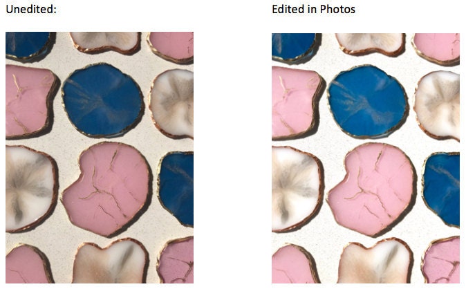
I mean, if you know how to use one, then by all means do it! But
if you're intimidated by the software or you don't want to pay for one, then
you can do all the editing you need right from your iPhone Photos app (sorry
Android users!). Instagram is good too, but I specifically like the way Photos
offers the option to change Brightness and Exposure. Note: I don't edit too
much, especially for Etsy, because I want the photos to look like the actual
product I'll be selling.
- Click 'Edit' in the top right corner.
- Along the bottom, click the white circle with dots around it (3rd icon)
- Click 'Light'. If you see a list, great! If you don't see a list, click the 'list' icon in the right corner.
- Typically, I increase (by a small amount): the Brightness and the Contrast. Sometimes I will also increase the Brilliance and Exposure.
- Now click on 'Colour'. If you see a list of 3, great! If you don't see a list, click the 'list' icon in the right corner.
- The only thing I ever do here is change the Cast (sometimes). Left makes the image more cool/blue toned. Right makes the image more warm/yellow toned.
TADA!


Comments
Post a Comment